100% FREE ONLINE DATING
sponsored links
| Topic: Seriously | |
|---|---|

|
Edited by
Peccy
on
Tue 02/17/09 04:59 PM
|
|
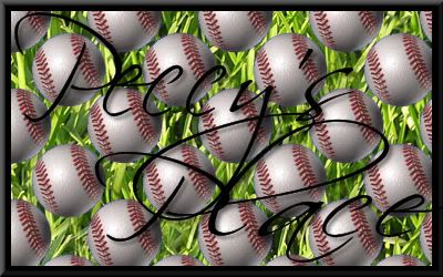
What do you think about my ebay logo? Just opened a store last night, should I change it? Oh yeah I sell baseball cards
|
|
|
|
|

|
|
|
I think it's great!
The only suggestion I could make is to do something to make the letters a little more visible. Otherwise, it's perfect! |
|
|
|
|
|
|
|
|
I think it's great! The only suggestion I could make is to do something to make the letters a little more visible. Otherwise, it's perfect! |
|
|
|
|

|
|
|
It is cool, but kind of hard to read with that pattern behind it. Just my opinion
|
|
|
|
|

|
Edited by
MelodyGirl
on
Tue 02/17/09 05:02 PM
|
|
Use the transparency feature to lighten the background (more opaque) then apply your name. It's difficult to see 'Peccy's Page' because it's competing with the background. I wouldn't say it's too busy but it's bright. Maybe a thicker font too?
|
|
|
|
|

|
|
|
Golly mister that sure is swell!
|
|
|
|
|
|
|
|
|
I think it's great! The only suggestion I could make is to do something to make the letters a little more visible. Otherwise, it's perfect! Another color, or maybe just keep the black letters but outline them in another color. |
|
|
|
|

|
|
|
I love the background, can't read the words very well...
|
|
|
|
|

|
|
|
Wow you opened a store. And you got one Item for sale.

|
|
|
|
|
|
|
|
|
I'll have to redo it, it's already been flattened and tweaked for the web.....I have a degree in this, think I wouldn't need to ask.
|
|
|
|
|
|
|
|
|
Wow you opened a store. And you got one Item for sale.
|
|
|
|
|

|
|
|
I like it as well... but like the rest, the font is a bit hard to read... maybe thicken it up some?
:=) |
|
|
|
|
|
|
|
|
When I get my last apartment finished I'll show you how to do ebay,

|
|
|
|
|

|
|
|
I like the background, but make it a little more opaque and try a thicker font......

|
|
|
|
|
|
|
|
|
When I get my last apartment finished I'll show you how to do ebay,
|
|
|
|
|

|
|
|
I think it's great! The only suggestion I could make is to do something to make the letters a little more visible. Otherwise, it's perfect! I agree. Neato Pec !!! |
|
|
|
|

|
|
|
I think it's great! The only suggestion I could make is to do something to make the letters a little more visible. Otherwise, it's perfect! I agree...the font kinda gets lost amongst the baseballs. |
|
|
|
|

|
|
|
Are you selling baseballs or cards?
The name is not distict enough font to immediately read with the background. If someone saw that as a business card they would be more likely to think it were a baseball bar/eatery. Peccy's Collectable's would be better. I know it is natural to want to put your Name on your business but if you are not a famous easilly recognizeable name associated with baseball and collector cards your disconnecting your market. If you have a lot of time and money to first build name recognition and then get customer's to associate that name with the products you sell. Useing a business name that starts you half way down the alpha listing on line doesn't sound like a good idea. Affordable Collectables by Peccy would move you up the food chain. P.S. I have some cards if you are interested. |
|
|
|
|
|
|
|
|
I was trying to keep it short with zip, something easily remembered, the baseball indicate what I'm selling. I sell other sports cards, but baseball is my bread and butter.
|
|
|
|
|

|
|
|
Geez you got alot of balls!!
|
|
|
|
|